What is Colour Theory? An Artist Tells Us
Two minute read. Written by Yamini Bharadwaj, grade 9 student.
Colour Theory’ refers to a set of guidelines concerning the use of colour in art and design.
Two minute read. Written by Yamini Bharadwaj, grade 9 student
‘Colour Theory’ refers to a set of guidelines concerning the use of colour in art and design. It is an indispensable part of art since it is a major factor in visually appealing compositions. Although still a subject in development, several studies claim that colour theory also plays a role in the psychological appeal of art. Thus, it seems that the beauty we find in artwork is rooted in colour harmony and the psychological impact it has on us.
What are the basics of colour theory?
There are few terms we have to get out of the way before we acquaint ourselves with colour harmony and psychology. These will help us better understand the concepts that follow.
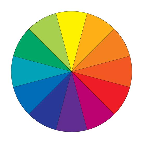
- Colour Wheel: A colour wheel is a circle showing different colours and their relationships with each other. There are three types of colours on the wheel. Primary, secondary and tertiary. Primary colours (as we learnt in nursery) are red, blue and yellow. They are pure and cannot be made by mixing other colours. Secondary colours are purple (blue and red), orange (red and yellow), and green (yellow and blue). They are made by mixing primary colours. Tertiary colours are made by mixing secondary colours. For instance, in the adjacent colour wheel, blue-green is a tertiary colour.
Hue: Hue is the actual colour in the colour wheel. Its saturation and tone have not been meddled with. Warm and cool refers to hue. Warmth and coolness of colours is determined by colour biases. If a red has an undertone of blue, it is a cool red. If it has an undertone of yellow it is a warm red. On the left is a warm red and on the right is a cool red.

- Tint/Shade/Tone: Tint is when white is added to a hue, shade is when black is added to a hue, and tone is when grey is added to the same hue.
- Saturation: Saturation is the vividness or intensity of a colour. For instance, DIC 156 (red on the left) is more saturated than DIC 292 (russet on the right).
What is ‘Colour Harmony’?

Colour harmony is at its simplest colour combinations and the results they produce. It is a term for colours that are thought to match and look pleasing next to each other. Opposite colours are complementary, which when placed together create a sharp contrast. When mixed together, they produce a greyscale colour between white and black. Adjacent colours on the colour wheel are called analogous colours. For instance, red and orange is an analogous pair. These colours blend well together thus the contrast is limited. A triad scheme consists of three evenly spaced colours on the wheel that contrast well with each other. For instance, in this colour wheel, the triads are yellow, blue, red and purple, orange and green. There are also other combinations such as split-complementary, rectangle (tetradic) and square colour schemes that can be made depending on the colour wheel used.
What is ‘Colour Psychology’?
Colour psychology is a matter of debate. Although at the moment there are but few papers with undisputed scientific research, it is a subject that more and more professionals are researching. The claims of colour psychology are that all colours can have both negative and positive psychological impacts on us. The type of impact is brought out by colour combinations. According to the research of several professionals like Angela Wright (author of The Beginner’s Guide to Colour Psychology), the idea that most of us view colour subjectively is untrue. Thus, the role of colour theory becomes increasingly important, so that the message of the artwork is conveyed efficiently. Here is a pdf based on the research of Angela Wright that further discusses colour psychology http://www.micco.se/wp-content/uploads/2010/05/Micco-Groenholm-on-Color-Affects-System.pdf
An Example of Colour Theory in Art
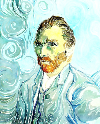
The renowned Vincent Van Gogh was a devoted student of colour theory, as can be noticed in his masterpieces. Colour theory has been employed in his ‘Self Portrait’ as well. Van Gogh has predominantly used the hues blue and orange (also green and a sort of dark brownish purple on the face and hair.) Blue and orange, we know are complementary colours that he used often in his art. Since they are complementary, they cancel each other and produce a sort of balance. A ‘tranquil’ colour scheme has also been employed, famous in the works of the impressionist, Monet. A cool colour, blue has been tinted and juxtaposed with an orange hue. Would orange be the dominant colour, the painting might be far less serene since it has been used largely as a hue – no tint has subdued its energy. Instead of using black for harsh shadows in the hair, Van Gogh has used a deep purple-brown shade closely placed with a tinted green, which too complement one another. Thus, nothing in the painting is luridly striking. The composition is harmonious.
Colour theory is a useful tool known to marketers and companies everywhere. It is used recurrently in our day to day lives. Not only can it help us make pleasing and conscious artistic decisions, it can also help us understand the message its user wants to convey to viewers.
By Yamini Bharadwaj
Yamini is an artist and a writer. She loves to paint in her free time.


Comments
Great Share! Can I just say what a relief to find someone who actually knows what theyre talking about on the internet. You definitely know how to bring an issue to light and make it important. More people need to read this and understand this side of the story. I cant believe youre not more popular because you definitely have the gift.
Hi, I found your article by mistake when i was searching internet for this issue, I have to say your content is in fact helpful I also love the theme, its amazing!. I dont have that much time to check out all your post at the moment but I have saved it and also add your RSS feeds. I will be back in a day or two. thanks for a great site.